
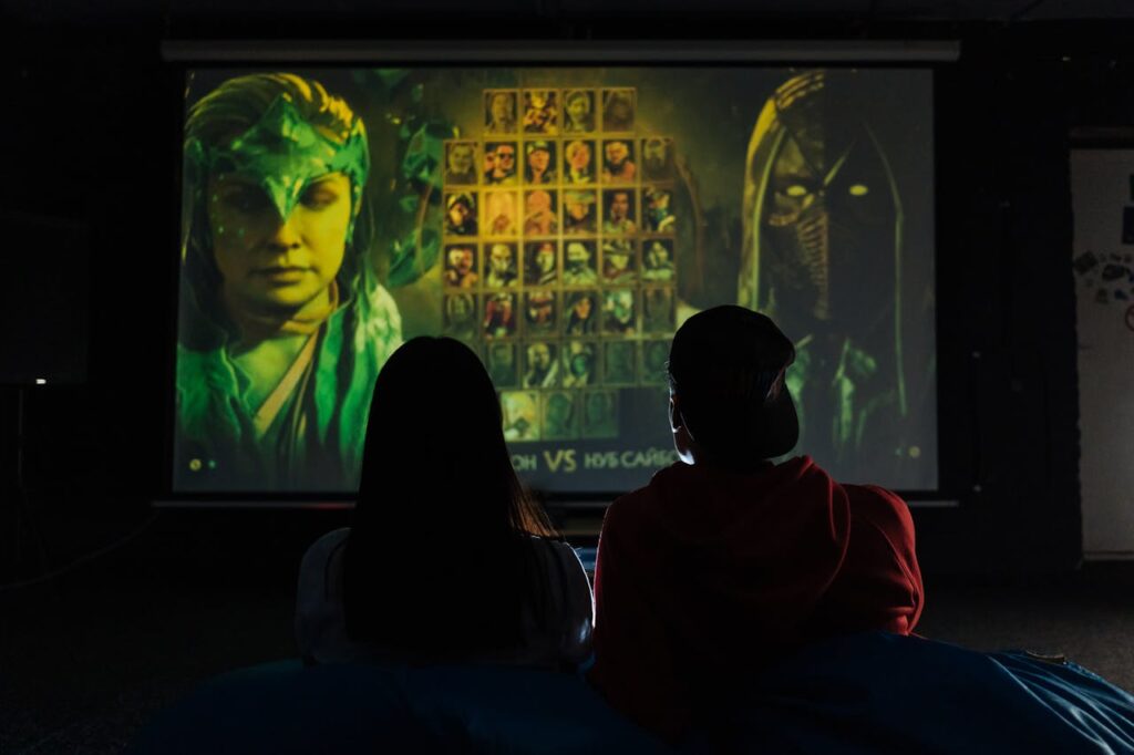
Immersive games stick with us long after they’re over. A careful blend of story, music, and—crucially—visual style creates that magic you remember.
From haunting forests to neon-lit cities, the way a game looks sets your expectations before you’ve pressed a single button or moved an inch.
Explore how visual style shapes the mood of digital worlds. Discover practical ways artists and developers use visuals to fine-tune atmospheres players won’t want to leave.
Setting the Emotional Tone with Color and Contrast
The right color choices lead players toward specific moods. Dimly lit palettes amplify tension; vibrant palettes encourage energy. Visual style here guides emotion from the first glance.
Compare a horror game’s bleak grays to a platformer’s cheerful blues and yellows. Each palette underlines a designer’s emotional goal, helping players sync their mood with the world.
Applying Consistent Color Schemes
A tight, consistent color scheme prevents mixed signals. For example, using only saturated reds and oranges in boss battles builds urgency. Players notice patterns subconsciously and react accordingly.
When making social spaces, soft neutral tones tell players it’s safe to relax. Imagine walking into a lounge area and immediately feeling calm thanks to gentle gradients and low contrast.
Consistency means players learn your game’s rules about color. This reduces confusion, making gameplay feel smoother and more natural from moment to moment.
Using Contrast to Guide Attention
High contrast elements direct the player’s gaze. For example, a glowing item draws focus in otherwise muted environments, giving players a visual hint about what’s important right now.
By using sharp light-dark contrasts at key locations, designers help without breaking immersion. Players follow these visual breadcrumbs instead of searching frustrated across every inch.
Try this: set a collectible item in a color that stands out from its surroundings. Players can spot it by instinct, letting the visual style nudge discovery.
| Visual Element | Atmospheric Effect | When to Use | Takeaway |
|---|---|---|---|
| Muted colors | Creates tension, introspection | Horror, mystery, puzzle | Reserve for unsettling moods and slow pacing |
| Bright colors | Infuses excitement, energy | Platformers, party games | Use to keep players upbeat and engaged |
| High contrast | Guides attention, highlights danger | Boss fights, hazards | Focus the player’s gaze with color separation |
| Monochrome | Focuses on shapes, nostalgia | Retro, meta games | Apply for a distinct, thematic identity |
| Pastels | Relaxes, comforts | Life sims, social games | Choose for cozy, laid-back moods |
Lighting Rules for Immersive Spaces
Lighting can transform a space from inviting to menacing in seconds. Artists use specific tricks to amplify atmosphere through illumination with great effect.
Watch for three-point lighting setups when walking through grand halls—these highlight characters and guide your next steps. The visual style sets expectations before anything is said.
Dynamic Lighting in Live Levels
Game worlds become reactive with dynamic lighting. Flickering torches or sudden lightning strikes make spaces feel alive. Visual style deepens with each interactive shadow or highlight.
You’ll notice anxiety rising when corridors are half-lit, uncertainty just ahead. Designers predict player feelings, raising stakes with simple shifts in luminance.
Try using real-time lighting changes to pace your game’s action. A daytime scene turning to night mid-play naturally signals new challenges are coming soon.
- Design with variable light: Let day-night cycles change mood dynamically; it diversifies exploration and keeps players engaged over time without extra assets.
- Simulate real shadows: Use obstacles to block light realistically, suggesting actual depth in 3D scenes; players trust environments that follow real-world physics.
- Harness colored lighting: Cast colored lights on architecture and characters to evoke specific emotions instantly, such as blue for melancholy or red for danger.
- Add interactive lights: Let players trigger lights through switches or actions; this increases immersion while subtly teaching cause and effect.
- Use darkness as a barrier: Hide threats in shadow zones that feel genuinely scary, pushing players to scan environments and manage risk thoughtfully.
Setting the tone with smart lighting means everyone feels every spike of tension, calm, or excitement without needing extra words or sounds.
Player-Led Light Choices
Give players torches or flashlights, and watch anxiety rise or fall as agency shifts. Interactive lighting tools embed visual style right into player hands, not just the backdrop.
Games where you select your light source deliver personal atmosphere tweaks. Try giving limited light supplies to crank up resource management and make every ray matter.
Player-powered lighting makes exploring less predictable. The tone can swing from safety to dread in a single hallway depending on choices made, all supporting the intended mood.
- Equip with customizable torches: Let players choose beam width or color; this supports different personalities and play methods in every environment.
- Limit light resources: Restrict battery life or oil to force strategic resource use; scarcity naturally raises stakes over time and boosts immersion.
- Offer environmental interactions: Allow candles or lamps to be lit and snuffed out at will; players enjoy this agency and use it for tactical decisions.
- Reflect visual changes instantly: Shadow and color changes based on light position reinforce that the player is shaping the game’s visual style in real time.
- Highlight environmental storytelling: Place story clues or secrets only visible under certain lighting, rewarding curious players with extra narrative depth.
Give agency over light, and watch how your community crafts their own atmosphere—sometimes tense, sometimes playful—each play session.
Animation Styles Shape Player Engagement
Spotting an exaggerated jump or fluid sword swing, you see how animation style clarifies character intent. This ties directly to atmosphere, changing how movement feels in your hands.
Realistic animation suits grounded drama, while stylized, bouncy motions keep tone light. The visual style guides players’ emotional reactions as much as any dialogue can.
Timing and Exaggeration for Dramatic Impact
Quick animation timing boosts adrenaline in fast-paced combat. Slow, deliberate moves in horror games build unease. This is where visual style meets responsive, tactile feedback.
Exaggeration draws focus. Think of a massive windup before a heavy punch—players instinctively flinch or brace themselves, heightening stakes and underscoring atmosphere.
Encourage teams to playtest different animation timings. See when tension spikes or calms, and adapt the style for emotional flow.
Environmental Animation Cues
Leaves rustling, lights flickering, or distant storms signal environmental mood shifts. These aren’t background flourishes—they’re essential elements of a consistent visual style.
Players who notice moving grass blades or unsteady candle flames feel anchored in your world. The right environmental animation removes visual static, guiding immersion forward.
Players remark, “I noticed the curtains fluttered when the window opened—felt real.” Concrete effects like these raise atmosphere reliability with every frame.
Texture Details Enhance Atmosphere Realism
Leaving surfaces blank drains atmosphere instantly. Textures communicate setting and weather—think wet cobblestones versus sun-dried sand. Visual style comes alive through deliberate material choices.
When artists add weathering—scratched paint, mossy bricks—they broadcast a world’s age and history. Rich textures pull players deeper, convincing them every detail could have a story.
Material Variation Tells Stories
Use mismatched textures to imply a space’s function or history. A pristine laboratory signals cleanliness; a rusted ship hull reveals past battles. Visual style grows richer with layered materials.
Introduce grime or dirt near high-traffic paths, subtly guiding discovery: “The floor’s worn most near this door.” Players track details, solving puzzles with environmental storytelling cues.
Try swapping a single texture from new to aged to signal timeline changes. Players instantly anchor new narrative phases to visual clues.
Small-Scale Patterns Capture Attention
Repeating small details—like patterned tiles or peeling wallpaper—acts as atmospheric anchors. These patterns provide players visual hooks, so environments are easier to remember and navigate.
Tiny imperfections, such as chipped wood or odd stains, humanize locations. When a player notices, “This table’s scratched where someone sat a blade down,” atmosphere grows personal and believable.
Pattern contrasts also highlight points of interest. Place a rare gem on patterned stone so players’ eyes naturally draw to it, thanks to the visual style’s guiding hand.
Shapes and Silhouettes Guide Player Perception
Distinct silhouettes let players identify threats, allies, or important objects instantly. Visual style shapes silhouette design to prioritize clarity and atmosphere in equal measure.
Sharp, angular shapes indicate danger or aggression. Rounded, oversized objects signal safety or comic relief. Well-crafted silhouettes accelerate player decision-making before any words appear.
Iconic Shape Language in Practice
Assign unique base shapes to each enemy type for instant recognition. Players learn “wide equals strong, thin equals weak,” applying visual logic to challenges on sight alone.
Shape repetition communicates world coherence—a round stone arch mirrors a moon above, suggesting intentional design. Use this to anchor puzzles or thematic continuity across environments.
Try using jagged rocks in enemy arenas to cue caution. Players interpret visuals as warnings, acting before explicit guidance ever appears.
Foreground and Background Separation
Visual style helps separate interactive elements from scenery. Foreground objects use distinct, non-overlapping shapes; backgrounds fade into less important silhouettes.
This prevents players getting “lost” or misreading spaces. Games prioritizing silhouette clarity minimize player confusion and improve flow across varied environments.
Introduce thicker outlines or shadow accents on playable paths. This visual tweak quickly tells players where they can go, supporting agency and exploration.
Environmental Storytelling with Visual Motifs
Placing the same banners, logos, or item types through different levels? This establishes visual language players come to recognize, deepening narrative atmosphere as they explore.
Using visual style for storytelling means weaving clues into the art. Bloodstains, torn flags, and shifting background murals each reveal hidden world details without dialogue.
Repeating Motifs for Depth
Install repeated motifs—like clocks or vines—along your main path to suggest time, decay, or other story layers. The visual style creates cohesion and expands the world’s sense of scale.
Players say, “Every time I find this crest, I know I’m near a boss.” Clear motifs reinforce mental maps. Try embedding secrets behind motif clusters for discovery rewards.
Let’s say every healer uses blue flowers. When players see these in ruins, they quickly infer past events. Visual style delivers meaning at a glance, supporting natural world-building.
Visual Foreshadowing and Payoff
Before a key plot twist, show recurring motifs growing more prominent or corrupted. Players spot this visual escalation and build anticipation subconsciously.
Visual foreshadowing works best when paired with sound or gameplay cues. For instance, cracked statues near danger zones signal trouble ahead, even before danger reveals itself.
When a motif’s meaning pays off—say, a symbol opens a hidden door—players feel clever, strengthening engagement and emotional investment in the game’s world.
Designing for Mood Consistency Across Genres
Maintaining a unified visual style makes games memorable, whatever genre. You’ll notice when visuals clash—think cartoony characters in a gritty world—which can shatter immersion fast.
Different genres need tailored style rules. Action games thrive on bold, readable visuals; slow-burning RPGs demand detail and subtlety for reflection and depth.
Mood-Pacing Through Asset Choices
Switch from sharp to soft edges as danger ebbs and flows. Designers time these shifts with narrative beats, letting visual style help pace play without user guesswork.
A fast chase? Swap blocky, clear models for blurred or smeared visuals to simulate speed. For downtime, switch to intricate, calming details that let players catch their breath.
Try this sequence: ramp up saturated colors and jagged forms during a boss fight, then transition to washed-out tones after victory. Players feel atmospheric shifts in step with the narrative.
Simple Rules for Consistency
Establish a fixed pipeline for assets—palette, texture format, post-processing—to prevent style drift. Share these standards with all team members; alignment grows stronger with each new asset.
List which moods call for which techniques and check new content with reference shots: “Foggy effects signal mystery, so add haze when uncertainty rises.”
Clear, shared guidelines cut confusion and accelerate ship dates, freeing energy for creative detail work rather than constant corrections mid-project.
- Define core palette up front: Stick to key color groups for locations and events to avoid jarring shifts that break immersion over time.
- Document asset naming: Use game-wide standards; consistent naming speeds up team handoffs and keeps visuals predictable for future updates.
- Sync environment references: Compile moodboards per area and circulate for revision; team-wide buy-in leads to fewer visual style clashes in complex levels.
- Specify genre fit: Outline how action, drama, or comedy impact styling decisions; clearer genre rules prevent mismatched assets that confuse players.
- Designate review cycles: Schedule checkpoints for visual style reviews, making it easier to address drift before public release or demo builds.
Final Thoughts on Atmosphere and Visual Style
The visual style you choose changes everything about a game’s atmosphere, from mood and pacing to player engagement. Each detail impacts how players interpret, explore, and remember your world.
Credible, well-implemented visual style supports game goals by reinforcing emotion, narrative, and interactive clarity. Players trust worlds where every color, texture, and shadow feels intentional.
Review your project for consistency and clear visual storytelling. Consider whether each asset amplifies the desired atmosphere, and let the visual style become your signature for lasting impact.